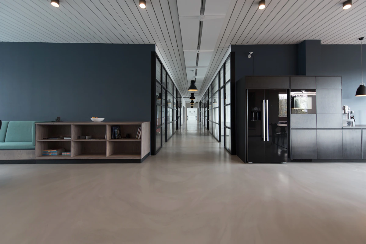
Choosing the right color palette for your office is more than just an aesthetic decision—it affects productivity, employee well-being, and brand perception. Here's our comprehensive guide to selecting the perfect colors for your workspace.
1. Understand Color Psychology
Colors evoke emotions and influence behavior. Blue promotes calm and focus, yellow encourages creativity, green reduces stress, and red can increase energy but should be used sparingly. Consider the nature of your work when selecting your primary palette.
"The right colors can boost productivity by up to 15% and improve employee satisfaction." — Design Psychology Research
2. Consider Your Brand Identity
Your office should be an extension of your brand. If your brand is bold and innovative, don't be afraid to use vibrant accent colors. For more traditional industries, neutral bases with subtle brand-colored accents work best.
3. Balance Warm and Cool Tones
A balanced palette creates harmony. Use warm tones (reds, oranges, yellows) in collaboration spaces to encourage interaction, and cool tones (blues, greens) in focus areas to promote concentration.
4. Lighting Matters
Colors look different under different lighting conditions. Test your palette samples under both natural and artificial light. Remember that north-facing rooms need warmer tones, while south-facing rooms can handle cooler palettes.
5. Don't Forget the 60-30-10 Rule
This classic design principle suggests using a dominant color for 60% of the space (walls), a secondary color for 30% (furniture), and an accent color for 10% (accessories). This creates a balanced, professional look.
Need help choosing the perfect palette for your office? Contact our design team for a personalized consultation.
Back to Blog